Corporate Design - Ophthalmic Practice
Trying to find a meaningful signet for an ophthalmic practice isn't easy. Especially if the idea, not to use any form of the "eye shape", comes to mind. So I tried to think outside the box and generalize the "function" of the eyesight - resolving in a new, trending, variable logotype including the name of the owner.
You may also like

Analogue Photography
2016
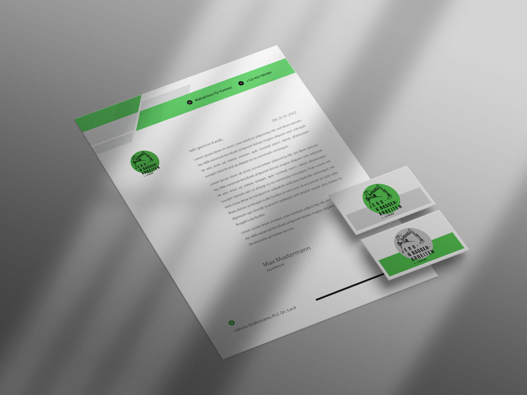
New Corporate Identity // Walking Excavator
2022

Metropolis vs Nature
2016

Soap Design
2015

Chronicle / 200th anniversary
2017
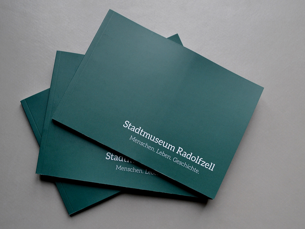
City Museum - New Conception
2018

Fragments of Fraser Island, AUS
2016
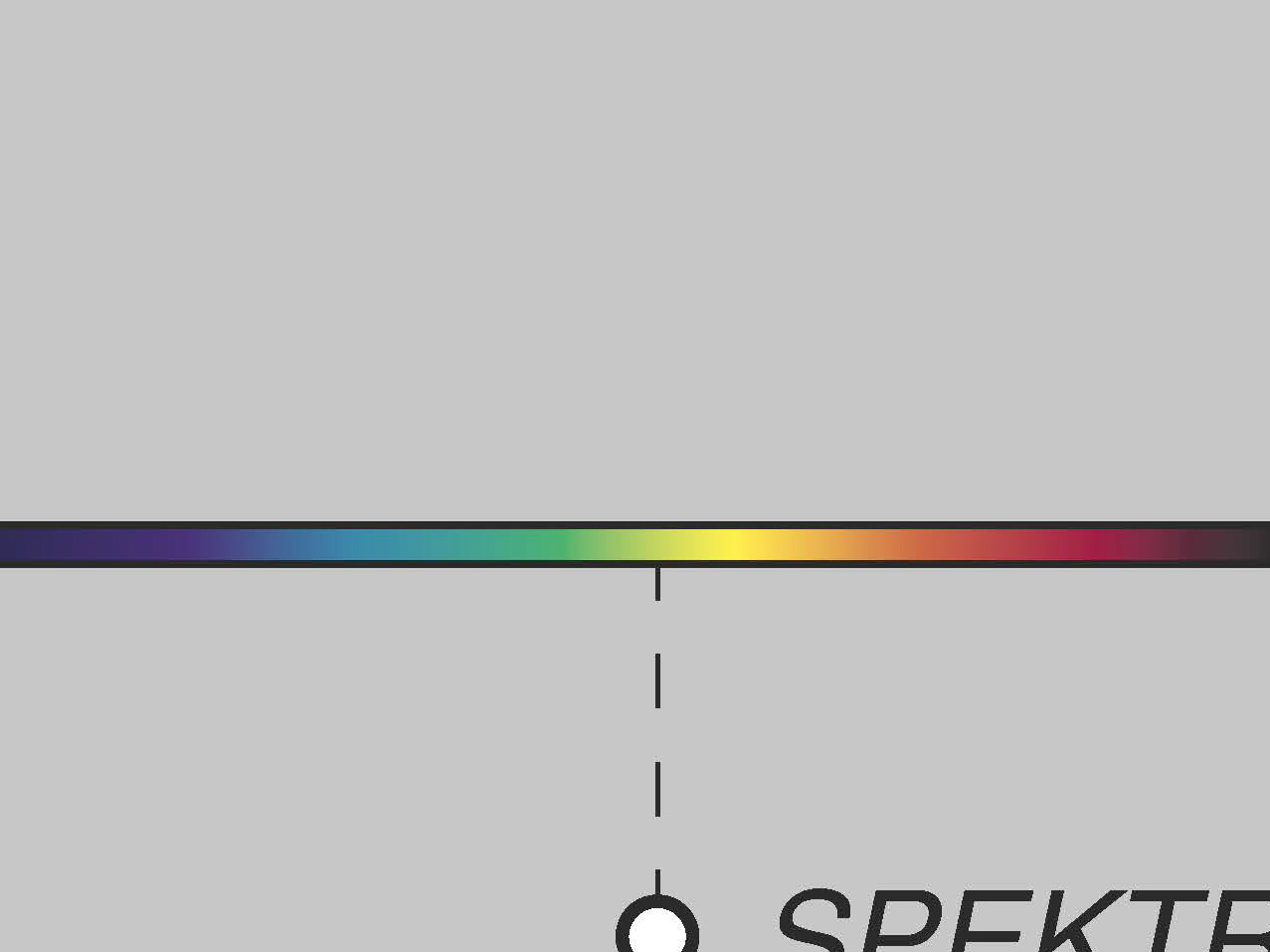
Color Perception
2018

Fragments of Switzerland
2015
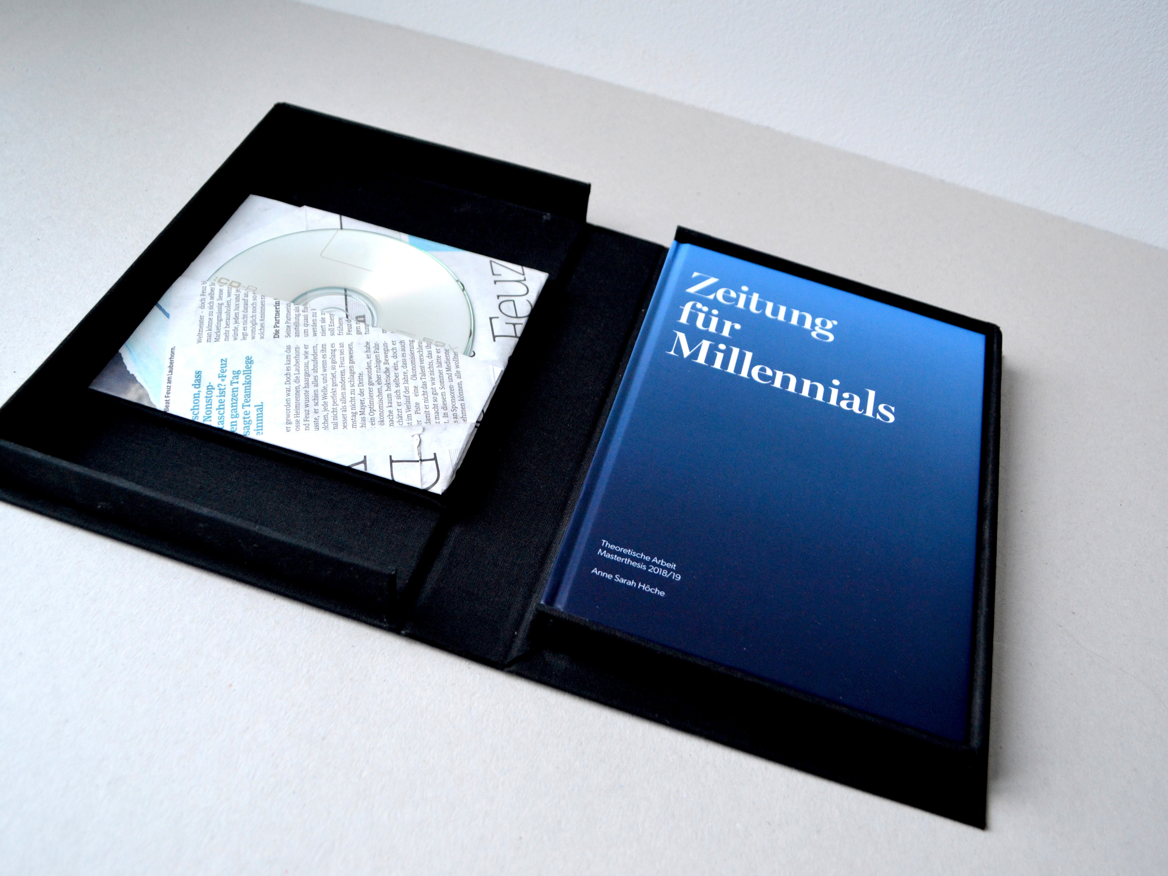
master's thesis // Zeitung für Millennials
2019