Soap Design
Soaps always look sad when they lose their shape and simply lie next to the sink edge. This soap packaging was designed to let the soap itself appear more valuable. The soap can be hung on the belt, so it doesn't smear the sink. The name of the soap is „brilliant“. Because why not? „Zum Seifen nah“ (in reach for soap) is a wordplay based on the German phrase „Zum Greifen nah“ (within reach).
You may also like

Chronicle / 200th anniversary
2017
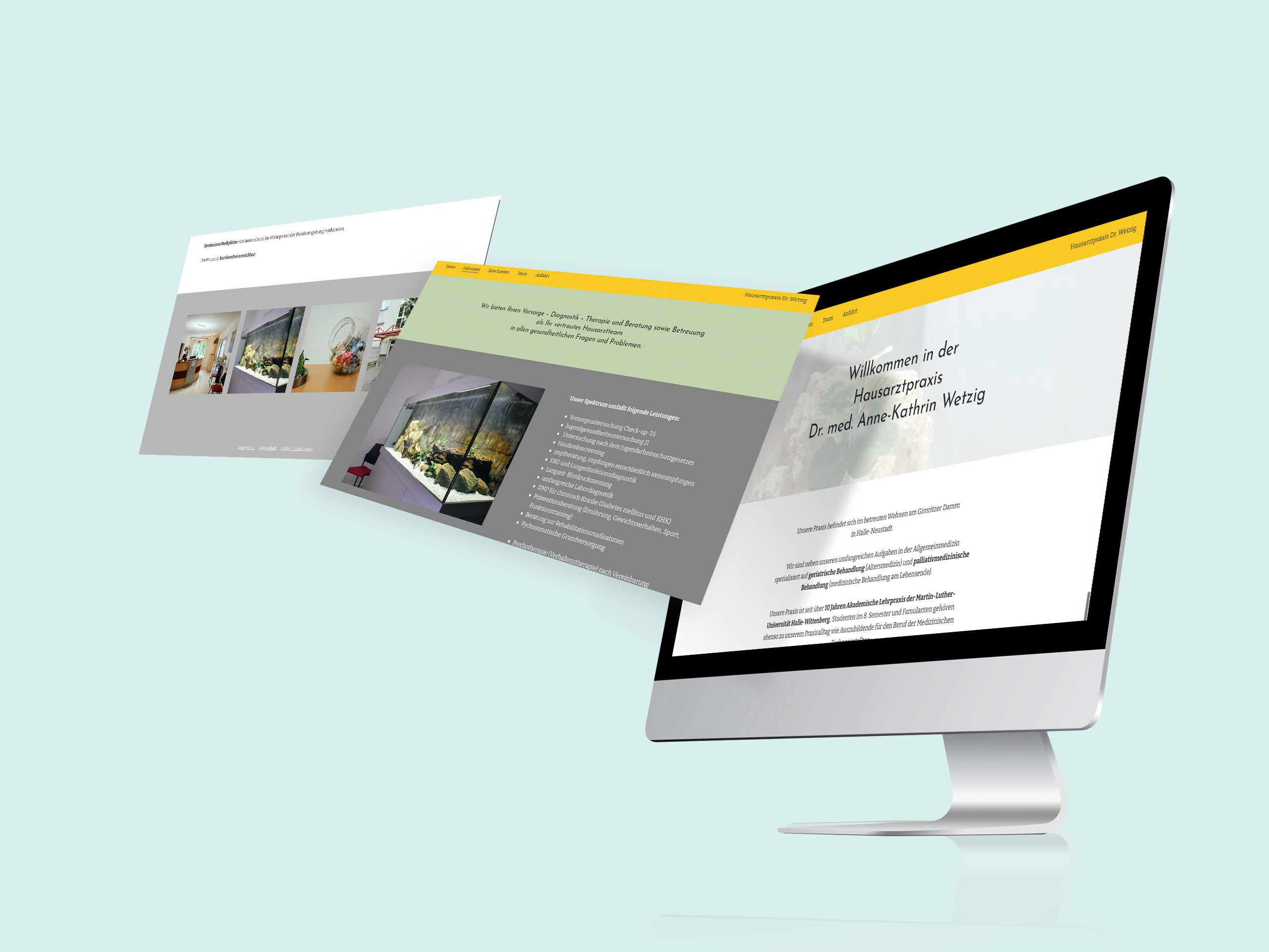
Website // Hausarztpraxis Dr. Wetzig
2023
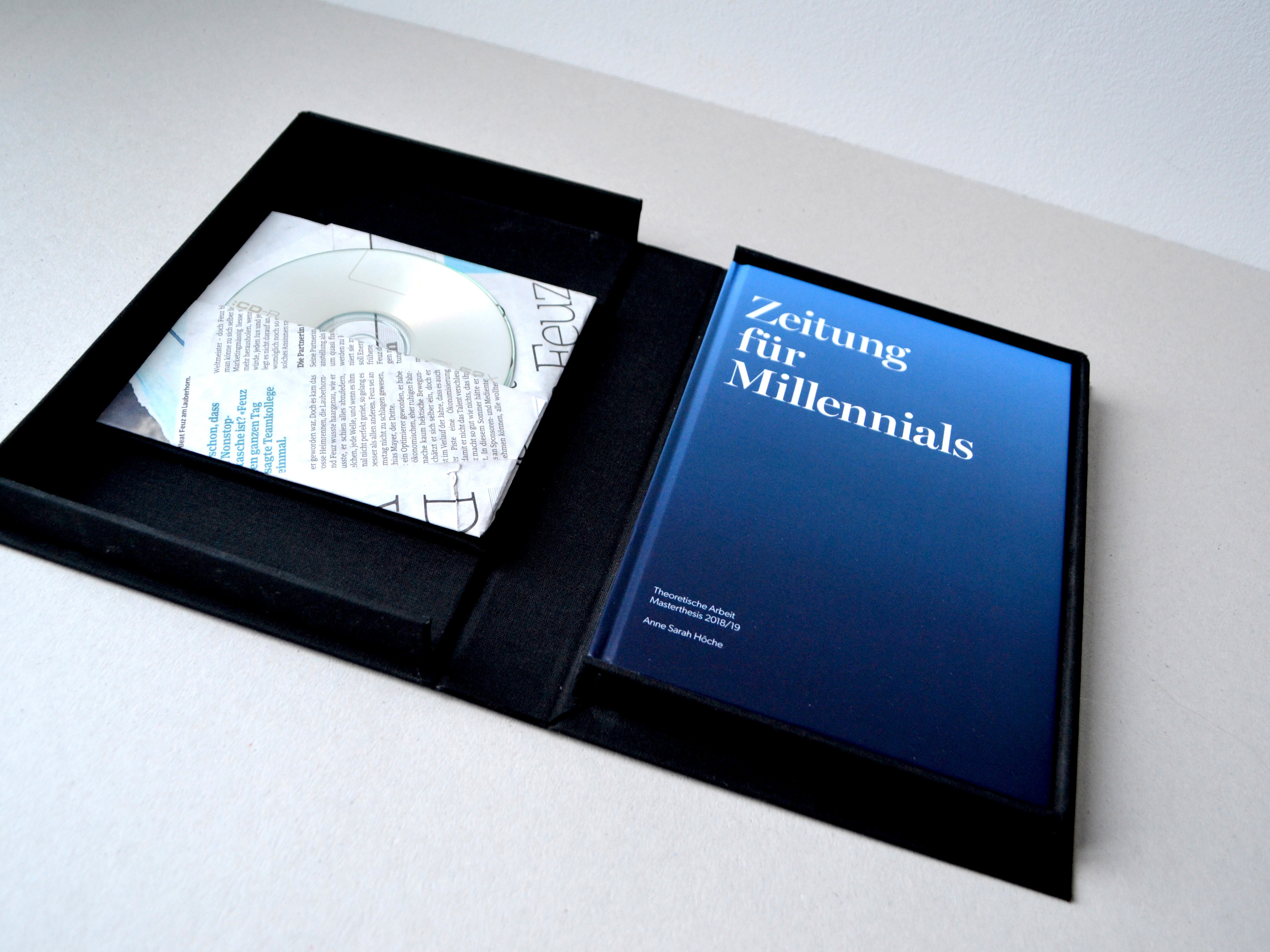
master's thesis // Zeitung für Millennials
2019
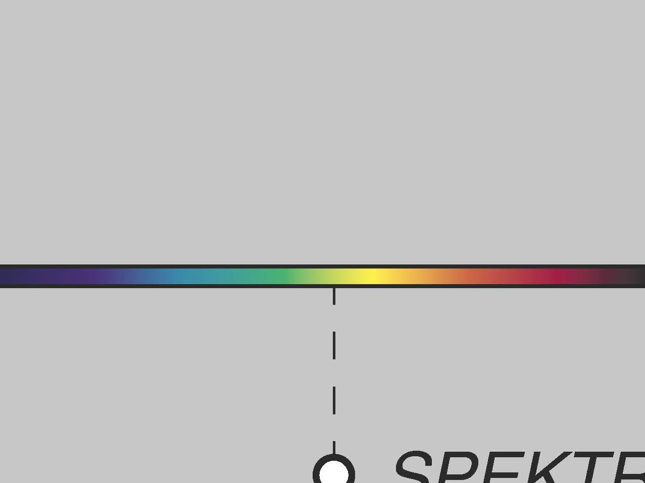
Color Perception
2018

Fragments of Switzerland
2015
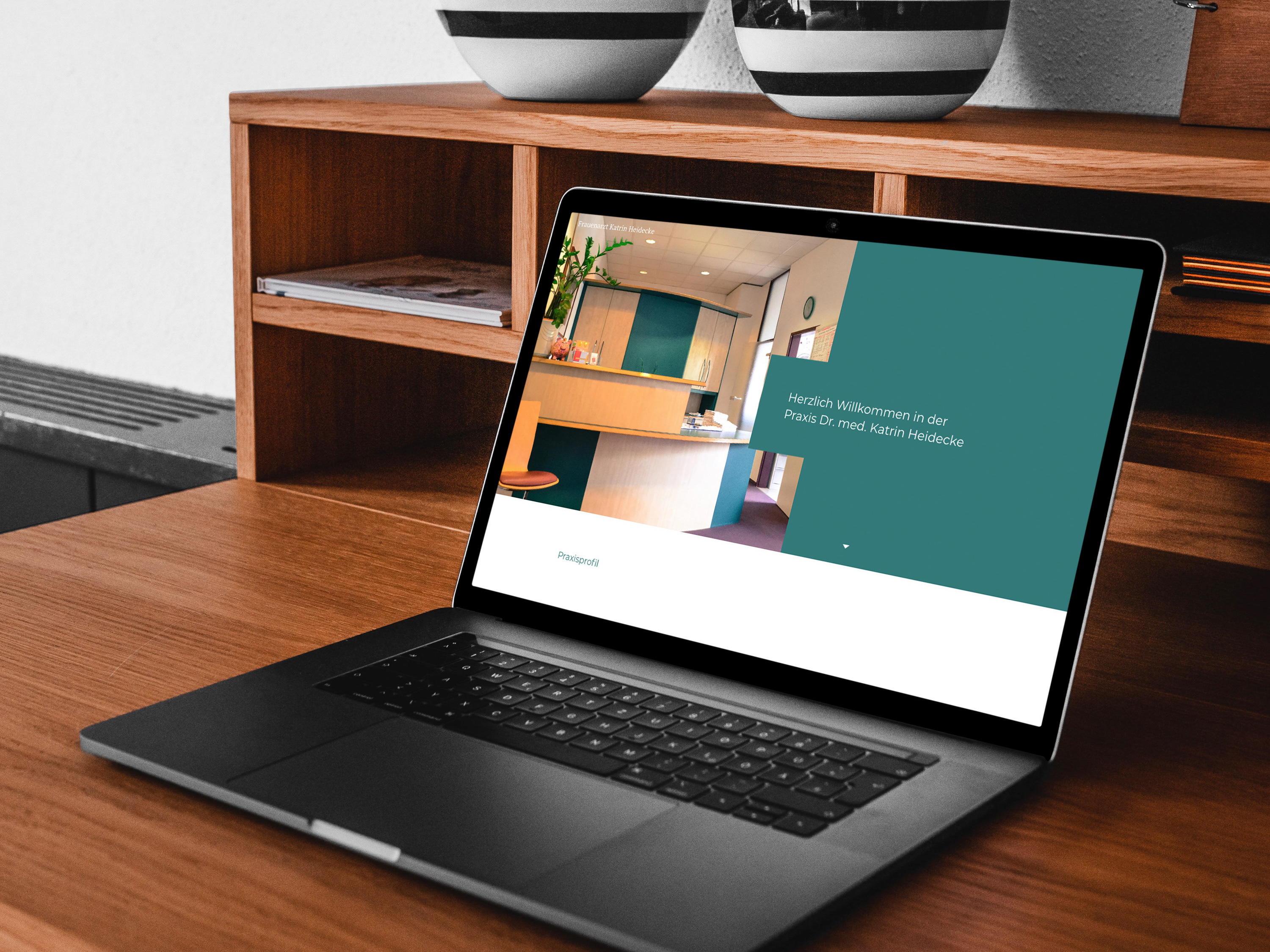
Redesign Praxis Dr. Heidecke
2021
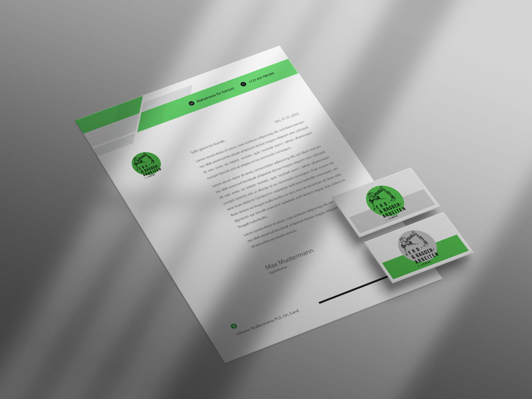
New Corporate Identity // Walking Excavator
2022
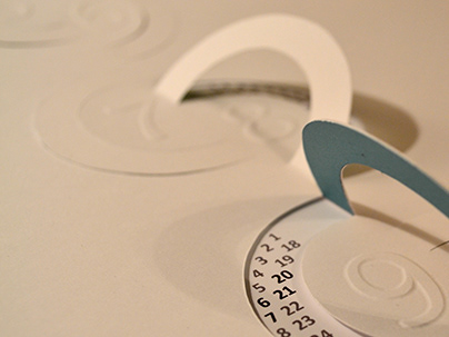
Infinity Calendar 2014
2014

Different Dimension
2014

Fragments of Fraser Island, AUS
2016